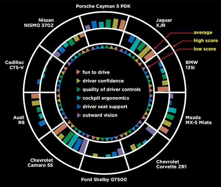
Clean lines, decent white space, categories colorized, has a legend… Â but this is still the Worst Graph in the World.

Who won? Â Who lost? Â Why is my head throbbing? Â Is a designer crying right now, cutting himself just to watch the Pantone 186 C drip to the floor?