Another iPhone app UI by Jeremiah Shaw

The Shot

The Original Layout

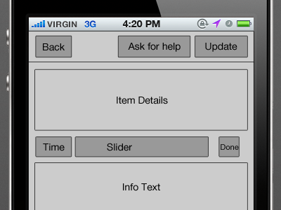
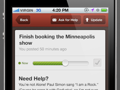
I had to make some assumptions as to the purpose of this screen.  I’m assuming the user clicked on one of their tasks and this is the task update screen.   The previous Shot on Dribbble shows tips and encouragements, so I’m assuming that’s what “ask for help” is all about.  

The slider is gorgeous, but is it adjusting the timeframe (“now” versus “later”) or the completion percentage of the task?   Is the checkbox for marking the task as complete?

I’ll do the layout
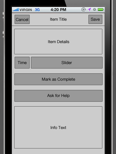
The header was a bit cluttered with an assortment of actions.  If this is truly a task update screen, let’s make it a normal Cancel/Save header.  Of course, keep the custom button treatment.

We can keep the now/later indicator and the slider together.    The slider is so beautiful, make it bigger!    If that checkbox really is a “complete” control, let’s pull that out.   The user should be excited to complete a task, so make it a big beautiful button that has a clear call-to-action.   Additionally, have a help call-to-action.

The text at the bottom of the Shot was just helper text, right?   If so, we can still tuck that at the bottom of the screen.
iPhone app UI by Jeremiah Shaw

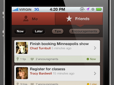
The Shot

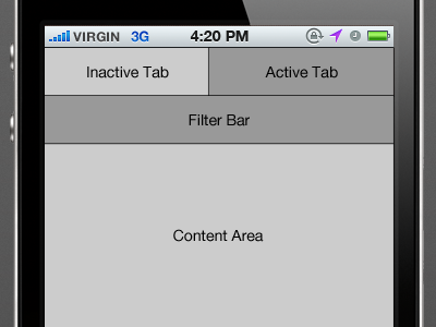
The Original Layout

Tabs on the top isn’t iOS friendly.    

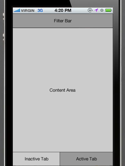
I’ll do the layout

You can definitely keep the custom UI for the tabs, just put them on the bottom. If you want to keep the notch that connects the tab to the filter bar, the filter bar can be docked to the bottom as well.

The Now/Later Tips/Encouragement tag filters are colored differently.  Based on the content in the mockup, the color has no relevance on whether the filter is active.  If you are trying to differentiate the types of filters, labels would be more efficient.

Digiti Back office

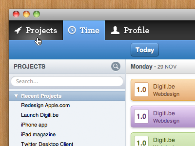
The Shot

The Original Layout

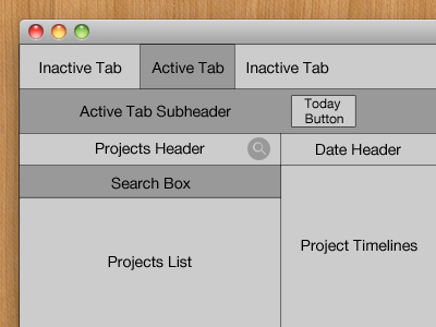
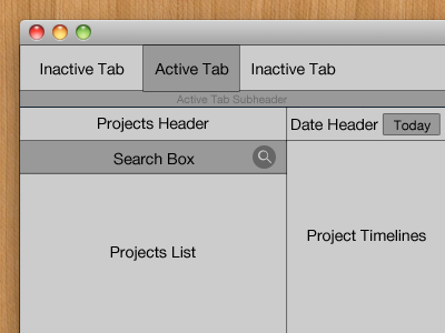
The only issue is the button placement.  The hierarchy is top-level nav (time/projects/profile), secondary projects nav (the list of projects) and then finally timelines for the project.    We need to associate those buttons with the proper areas.   The search button is in the projects header but we are already showing a search box.   If you meant the search button to reveal the search box, the button should be visually connected to the box.   If not, we should move the button down next to the search box.

The second button problem is the Today button.  Why is it floating in the tab subheader?   If it is used to jump to the project timeline for today, it should be in the date header.    

I’ll do the layout

By moving the Today button out of the subheader, you can shrink it down.  You can still use a thin, colorful subheader to help the user know what area of the site they are using.  Â